ROC curves in statistics.
As a data scientist or machine learning engineer, you know how important it is to evaluate the performance of your models. ROC curves are a powerful tool for measuring the accuracy of binary classification models and selecting the best threshold for your model's predictions. In this guide, we'll walk you through everything you need to know about ROC curves and how to create them using Python. Whether you're a beginner or an experienced data scientist, our tutorials and examples will help you master this essential technique and take your machine learning skills to the next level.

Python Knowledge Base: Make coding great again.
- Updated:
2026-07-22 by Andrey BRATUS, Senior Data Analyst.
Generating data and drawing ROC curves:
Interpreting ROC Curves.
Conclusion.
A ROC curve or receiver operating characteristic curve, is a graphical plot that illustrates the diagnostic ability of a binary classifier system as its discrimination thresholds are varied. The ROC curve is created by plotting the true positive rate (TPR) against the false positive rate (FPR) at various threshold settings.
The top left corner of the plot is the “ideal” point - a false positive rate of zero, and a true positive rate of one. This is not very realistic, but it means that a larger area under the curve (AUC) is usually better.
Also:
Smaller values on the x-axis of the plot indicate lower false positives and higher true negatives.
Larger values on the y-axis of the plot indicate higher true positives and lower false negatives.
import numpy as np
import matplotlib.pyplot as plt
import scipy.stats as stats
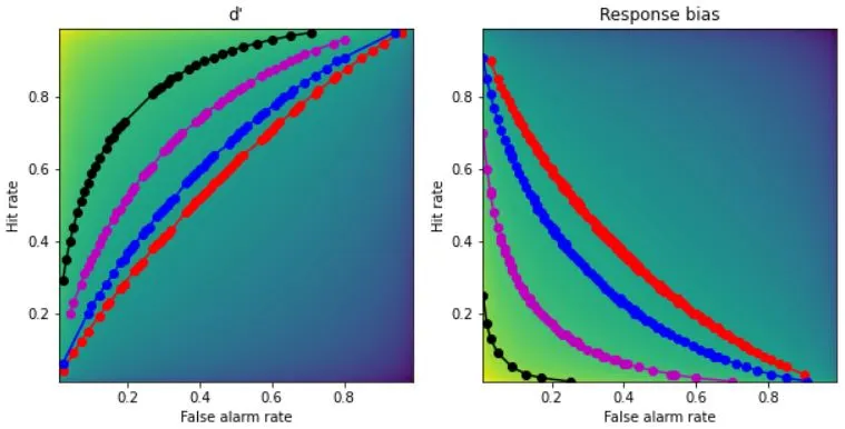
## generating d-prime and response bias
x = np.arange(.01,1,.01)
dp = np.tile(stats.norm.ppf(x),(99,1)).T - np.tile(stats.norm.ppf(x),(99,1))
rb = -( np.tile(stats.norm.ppf(x),(99,1)).T + np.tile(stats.norm.ppf(x),(99,1)) )/2
## create the 2D bias spaces and plot their ROC curves
rb2plot = [.3, .5, .9, 1.5] # d'/bias levels
tol = .01 # tolerance for matching levels
colorz = 'rbmk'
# setup the figure
fig,ax = plt.subplots(1,2,figsize=(10,5))
# show the 2D spaces
ax[0].imshow(dp,extent=[x[0],x[-1],x[0],x[-1]],origin='lower')
ax[0].set_xlabel('False alarm rate')
ax[0].set_ylabel('Hit rate')
ax[0].set_title("d'")
ax[1].imshow(rb,extent=[x[0],x[-1],x[0],x[-1]],origin='lower')
ax[1].set_xlabel('False alarm rate')
ax[1].set_ylabel('Hit rate')
ax[1].set_title('Response bias')
### now draw the isocontours
for i in range(len(rb2plot)):
# find d' points
idx = np.where((dp>rb2plot[i]-tol) & (dp<=rb2plot[i]+tol))
ax[0].plot(x[idx[1]],x[idx[0]],'o-',color=colorz[i])
# find bias points
idx = np.where((rb>rb2plot[i]-tol) & (rb<=rb2plot[i]+tol))
ax[1].plot(x[idx[1]],x[idx[0]],'o-',color=colorz[i])
plt.show()
Interpreting ROC Curves is a crucial aspect of Data Science. These curves help in evaluating a classifier's performance by visualizing the relationship between the True Positive Rate (TPR) and the False Positive Rate (FPR).
Finding the optimal threshold value for classification is vital to distinguish between positive and negative classes. The ROC curve's point closest to the top left-hand corner indicates the optimal threshold value for the classifier.
Choosing the best classifier using ROC curves is another significant aspect to consider. The classifier with the highest AUC score has the best performance and is preferred over others. Moreover, comparing ROC curves of different classifiers can help in choosing the best model for the given data.
But beware of one thing - never use ROC curves to compare models with unbalanced class distributions. It might be misleading and can further lead to incorrect conclusions.
ROC curves are a powerful tool that can help in showcasing a classifier's performance. By following simple steps, one can utilize the power of ROC curves and find the best fit model for their data.
In summary, understanding ROC curves is crucial for data scientists as it helps in evaluating the performance of classification models. The true positive rate (TPR) and false positive rate (FPR) are key components of ROC curves, while the area under the curve (AUC) is used as a metric for model comparison. By analyzing ROC curves, optimal threshold values for classification and the best classifier can be chosen. Python's scikit-learn library provides useful functions for plotting and analyzing ROC curves. As a data scientist, knowing how to interpret ROC curves will come in handy when evaluating the performance of classification models.