CLT quick dive.
Welcome to the fascinating intersection of Python and the Central Limit Theorem. As one of the most pivotal concepts in statistics, the Central Limit Theorem serves as the foundation for many analytical techniques. With the power of Python, we can demystify this theorem, making it more accessible and practical for data enthusiasts of all levels. Whether you're a budding data scientist or a seasoned analyst, our comprehensive guide will help you harness the theorem's potential, using Python to illuminate its principles and applications.
Get ready to dive into a world where statistics meet programming, and theory becomes practice.

Python Knowledge Base: Make coding great again.
- Updated:
2026-07-11 by Andrey BRATUS, Senior Data Analyst.
Creating data with a power-law distribution:
Distribution of samples means:
Mixing 2 non-Gaussian datasets to get Gaussian combined signal:
Interpreting the results.
Limitations of CLT.
Conclusion.
The Central Limit Theorem states that the sampling distribution of the sample means approaches a normal distribution - the “bell curve” - as the sample size gets larger — no matter what the shape of the population distribution.
In other words more samples you takes, especially large ones, your graph of the sample means will look more like a normal distribution.
Sample sizes equal to or greater than 30 are often considered sufficient for the CLT to hold, may differ in some cases.A sufficiently large sample size can predict the characteristics of a population more accurately.
import matplotlib.pyplot as plt
import numpy as np
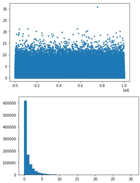
# data
N = 1000000
data = np.random.randn(N)**2
# alternative data
# data = np.sin(np.linspace(0,10*np.pi,N))
# show the distribution
plt.plot(data,'.')
plt.show()
plt.hist(data,40)
plt.show()
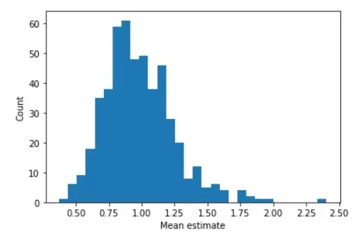
## repeated samples of the mean

samplesize   = 30
numberOfExps = 500
samplemeans  = np.zeros(numberOfExps)

for expi in range(numberOfExps):
    # get a sample and compute its mean
    sampleidx = np.random.randint(0,N,samplesize)
    samplemeans[expi] = np.mean(data[ sampleidx ])


# and show its distribution
plt.hist(samplemeans,30)
plt.xlabel('Mean estimate')
plt.ylabel('Count')
plt.show()
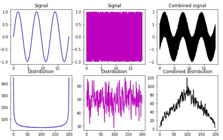
IMPORTANT: 2 datasets should be properly scaled !!!
# create two datasets with non-Gaussian distributions
x = np.linspace(0,6*np.pi,10001)
s = np.sin(x)
u = 2*np.random.rand(len(x))-1

fig,ax = plt.subplots(2,3,figsize=(10,6))
ax[0,0].plot(x,s,'b')
ax[0,0].set_title('Signal')

y,xx = np.histogram(s,200)
ax[1,0].plot(y,'b')
ax[1,0].set_title('Distribution')

ax[0,1].plot(x,u,'m')
ax[0,1].set_title('Signal')

y,xx = np.histogram(u,200)
ax[1,1].plot(y,'m')
ax[1,1].set_title('Distribution')

ax[0,2].plot(x,s+u,'k')
ax[0,2].set_title('Combined signal')

y,xx = np.histogram(s+u,200)
ax[1,2].plot(y,'k')
ax[1,2].set_title('Combined distribution')

plt.show()
Analyzing the distribution of sample means is crucial to understanding the Central Limit Theorem (CLT). One of the key takeaways from the CLT is that as the sample size increases, the distribution of the sample means becomes approximately normal. To check this, we can calculate the mean and standard deviation of the sample means and compare them to the theoretical values of the population mean and standard deviation.
We can also visualize the output using probability plots. A probability plot shows the distribution of the sample means compared to the theoretical normal distribution. If the data follows a straight line, then it can be assumed that the sample means are normally distributed. The closer the data points are to the line, the more normal the distribution is.
By analyzing the distribution of the sample means and comparing them to the theoretical values, we can confirm the validity of the CLT. This is an important tool for statistical inference and hypothesis testing, allowing us to make accurate conclusions about a population based on a sample. Always remember, the larger the sample size, the better the approximation of the population distribution.
The Central Limit Theorem (CLT) is a powerful statistical concept that allows us to estimate population parameters using sample statistics. However, there are certain limitations to CLT that we need to keep in mind while using it.
Firstly, CLT assumes that the sample size is large enough (typically, n>=30). Hence, if our sample size is smaller, we might not get accurate estimates. Secondly, CLT assumes that the samples are independent of each other. This means that each observation should not be influenced by any other observation in the sample.
Thirdly, extreme outliers in the sample can also affect the accuracy of CLT estimates. Lastly, CLT assumes that the data follows a normal distribution. If our data is not normally distributed, then the results obtained through CLT might not be reliable.
Thus, while using CLT for statistical analysis, we need to be aware of its limitations and ensure that the underlying assumptions are met to get accurate results.
In summary, Central Limit Theorem provides a powerful tool to estimate population parameters from sample data. Using Python's NumPy and Matplotlib libraries, we can simulate CLT and draw valuable insights. However, there are limitations, such as sample size, outliers, normality assumptions, and dependence on independent samples. Keeping these issues in mind, CLT can be a valuable addition to a data scientist's arsenal.