Seaborn use case.
Seaborn is a special visualization library for making statistical graphics and charts in Python.
Seaborn was created on top of matplotlib and integrated closely with Pandas dataset structures.
So you can guess tha it's visual and statistial oriented features are nicer and more advanced than matplotlib has.

Python Knowledge Base: Make coding great again.
- Updated:
2026-07-17 by Andrey BRATUS, Senior Data Analyst.
Plot creation algorithm.
Preparing the data.
Controlling the plot - one subplot.
Controlling the plot - Seaborn styles.
Controlling the plot - Context Functions.
Controlling the plot - Color Palette.
Plotting With Seaborn - Axis Grids.
Plotting With Seaborn - Categorical Plots.
Plotting With Seaborn - Regression Plots.
Plotting With Seaborn - Distribution Plots.
Plotting With Seaborn - Matrix Plots.
Customizing the plot.
Showing and Saving the Plot.
Close & Clear.
Seaborn practices data driven approach and helps us explore and understand available data in a smart way. Its plotting functions operate on Pandas dataframes and NumPy arrays and internally perform the necessary semantic mapping and statistical aggregation to produce enlightening graphic plots, that help us focus on better data understanding, rather than on the details of how to draw them.
The main steps for creating the plots with Seaborn are:
1 Preparing the data
2 Controlling the plot
3 Plotting
4 Customizing the plot
5 Showing and saving the plot
import matplotlib.pyplot as plt
import seaborn as sns
tips = sns.load_dataset("tips") # Step 1
sns.set_style("whitegrid") # Step 2
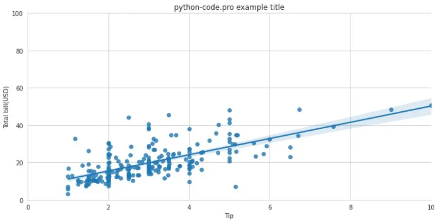
g = sns.lmplot(x="tip", # Step 3
y="total_bill",
data=tips,
aspect=2)
g = (g.set_axis_labels("Tip","Total bill(USD)").
set(xlim=(0,10),ylim=(0,100))) # Step 4
plt.title("title")
plt.show(g) # Step 5
import pandas as pd
import numpy as np
uniform_data = np.random.rand(10, 12)
data = pd.DataFrame({'x':np.arange(1,101),
'y':np.random.normal(0,4,100)})

# you can also use built-in datasets
titanic = sns.load_dataset("titanic")
iris = sns.load_dataset("iris")
f, ax = plt.subplots(figsize=(5,6))
sns.set() #(Re) set the seaborn default
sns.set_style("whitegrid") #Set the matplotlib parameters
sns.set_style("ticks",
{"xtick.major.size":8,
"ytick.major.size":8})
sns.axes_style("whitegrid")
sns.set_context("talk") #Set context to "talk"
sns.set_context("notebook", #Set context to "notebook",
font_scale=1.5, #Scale font elements and override param mapping
rc={"lines.linewidth":2.5})
sns.set_palette("husl",3) #Define the color palette
sns.color_palette("husl") #Use with with to temporarily set palette
flatui = ["#9b59b6","#3498db","#95a5a6","#e74c3c","#34495e","#2ecc71"]
sns.set_palette(flatui) #Set your own color palette
g = sns.FacetGrid(titanic, #Subplot grid for plotting conditional relationships
col="survived",
row="sex")
g = g.map(plt.hist,"age")
sns.factorplot(x="pclass", #Draw a categorical plot onto a Facetgrid
y="survived",
hue="sex",
data=titanic)
sns.lmplot(x="sepal_width", #Plot data and regression model fits across a FacetGrid
y="sepal_length",
hue="species",
data=iris)

h = sns.PairGrid(iris) #Subplot grid for plotting pairwise relationships
h = h.map(plt.scatter)
sns.pairplot(iris) #Plot pairwise bivariate distributions
i = sns.JointGrid(x="x", #Grid for bivariate plot with marginal univariate plots
y="y",
data=data)
i = i.plot(sns.regplot,
sns.distplot)
sns.jointplot("sepal_length", #Plot bivariate distribution
"sepal_width",
data=iris,
kind='kde')
#Scatterplot
sns.stripplot(x="species", #Scatterplot with one categorical variable
y="petal_length",
data=iris)
sns.swarmplot(x="species", #Categorical scatterplot with non-overlapping points
y="petal_length",
data=iris)

#Bar Chart
sns.barplot(x="sex", #Show point estimates and confidence intervals with scatterplot glyphs
y="survived",
hue="class",
data=titanic)

#Count Plot
sns.countplot(x="deck", #Show count of observations
data=titanic,
palette="Greens_d")

#Point Plot
sns.pointplot(x="class", #Show point estimates and confidence intervals as rectangular bars
y="survived",
hue="sex",
data=titanic,
palette={"male":"g",
"female":"m"},
markers=["^","o"],
linestyles=["-","--"])

#Boxplot
sns.boxplot(x="alive", #Boxplot
y="age",
hue="adult_male",
data=titanic)
sns.boxplot(data=iris,orient="h") #Boxplot with wide-form data

#Violinplot
sns.violinplot(x="age", #Violin plot
y="sex",
hue="survived",
data=titanic)
sns.regplot(x="sepal_width", #Plot data and a linear regression model fit
y="sepal_length",
data=iris,
ax=ax)
plot = sns.distplot(data.y, #Plot univariate distribution
kde=False,
color="b")
sns.heatmap(uniform_data,vmin=0,vmax=1) #Heatmap
g.despine(left=True) #Remove left spine
g.set_ylabels("Survived") #Set the labels of the y-axis
g.set_xticklabels(rotation=45) #Set the tick labels for x
g.set_axis_labels("Survived", #Set the axis labels
"Sex")
h.set(xlim=(0,5), #Set the limit and ticks of the x-and y-axis
ylim=(0,5),
xticks=[0,2.5,5],
yticks=[0,2.5,5])

plt.title("A Title") #Add plot title
plt.ylabel("Survived") #Adjust the label of the y-axis
plt.xlabel("Sex") #Adjust the label of the x-axis
plt.ylim(0,100) #Adjust the limits of the y-axis
plt.xlim(0,10) #Adjust the limits of the x-axis
plt.setp(ax,yticks=[0,5]) #Adjust a plot property
plt.tight_layout() #Adjust subplot params
plt.show() #Show the plot
plt.savefig("foo.png") #Save the plot as a figure
plt.savefig("foo.png", #Save transparent figure
transparent=True)
plt.cla() #Clear an axis
plt.clf() #Clear an entire figure
plt.close() #Close a window