Matplotlib use case.
Matplotlib is an essential modern visualization library in Python for 2D plots of arrays and datasets.
It is a multi-platform data visualization tool built on NumPy arrays and ready to be used with the broader SciPy stack.
Matplotlib produces publication-quality figures in a variety of predefined formats and interactive environments across platforms.

Python Knowledge Base: Make coding great again.
- Updated:
2026-07-19 by Andrey BRATUS, Senior Data Analyst.
Plot creation algorithm.
Initial Data Preparation.
Creating a Plot.
Plotting - 1D Data.
Plotting - 2D Data.
Plotting - Vectors.
Plotting - Data distributions.
Customizing a Plot - Markers.
Customizing a Plot - Linestyles.
Customizing a Plot - Text & Annotations.
Customizing a Plot - Mathtext.
Customizing a Plot - Limits, Legends & Layouts.
Saving the Plot.
Show Plot.
Close & Clear.
The biggest power of visualization is that it allows us visual access to huge amounts of data in easily acceptable visual format. Matplotlib proposes to use several plots like lineplots, barcharts, scatterplots, histogram etc.
The main steps for creating the plots with matplotlib are:
1 Preparing the data
2 Creating the plot
3 Plotting
4 Customizing the plot
5 Saving the plot
6 Showing the plot
import matplotlib.pyplot as plt
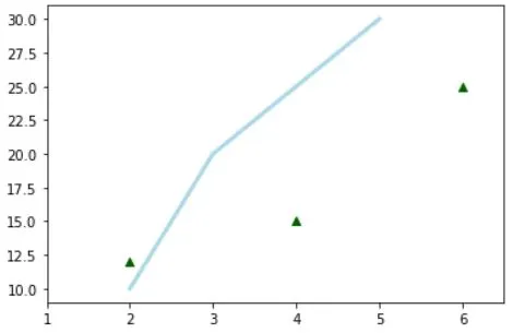
x = [2,3,4,5] # Step 1
y = [10,20,25,30]
fig = plt.figure() # Step 2
ax = fig.add_subplot(111) # Step 3
ax.plot(x, y, color='lightblue', linewidth=3) # Step 4
ax.scatter([2,4,6],
[12,15,25],
color='darkgreen',
marker='^')
ax.set_xlim(1, 6.5)
plt.savefig('figure.png') # Step 5
plt.show() # Step 6
import numpy as np
x = np.linspace(0, 10, 100)
y = np.cos(x)
z = np.sin(x)
data = 2 * np.random.random((10, 10))
data2 = 3 * np.random.random((10, 10))
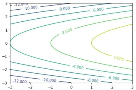
Y, X = np.mgrid[-3:3:100j, -3:3:100j]
U = -1 - X**2 + Y
V = 1 + X - Y**2
import matplotlib.pyplot as plt

# adding figures
fig = plt.figure()
fig2 = plt.figure(figsize=plt.figaspect(2.0))

# adding axes
ax1 = fig.add_subplot(221) # row-col-num
ax3 = fig.add_subplot(212)
fig3, axes = plt.subplots(nrows=2,ncols=2)
fig4, axes2 = plt.subplots(ncols=3)
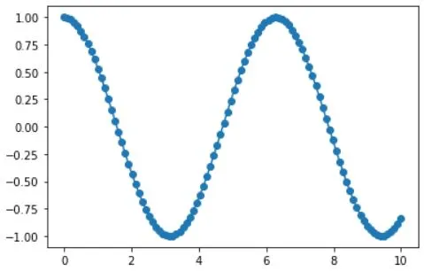
# 1D Data
fig, ax = plt.subplots()
lines = ax.plot(x,y) #Draw points with lines or markers connecting them
ax.scatter(x,y) #Draw unconnected points, scaled or colored
axes[0,0].bar([1,2,3],[3,4,5]) #Plot vertical rectangles (constant width)
axes[1,0].barh([0.5,1,2.5],[0,1,2]) #Plot horiontal rectangles (constant height)
axes[1,1].axhline(0.45) #Draw a horizontal line across axes
axes[0,1].axvline(0.65) #Draw a vertical line across axes
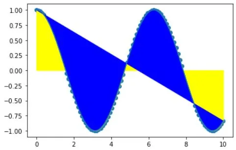
ax.fill(x,y,color='blue') #Draw filled polygons
ax.fill_between(x,y,color='yellow') #Fill between y-values and 0
# 2D Data

axes2[0].pcolor(data2) #Pseudocolor plot of 2D array
axes2[0].pcolormesh(data) #Pseudocolor plot of 2D array
CS = plt.contour(Y,X,U) #Plot contours
axes2[2].contourf(data) #Plot filled contours
axes2[2]= ax.clabel(CS) #Label a contour plot
# Vector fields

axes[0,1].arrow(0,0,0.5,0.5) #Add an arrow to the axes
axes[1,1].quiver(y,z) #Plot a 2D field of arrows
axes[0,1].streamplot(X,Y,U,V) #Plot a 2D field of arrows
# Data distributions

ax1.hist(y) #Plot a histogram
ax3.boxplot(y) #Make a box and whisker plot
ax3.violinplot(z) #Make a violin plot
fig, ax = plt.subplots()
ax.scatter(x,y,marker=".")
ax.plot(x,y,marker="o")
plt.plot(x,y,linewidth=4.0)
plt.plot(x,y,ls='solid')
plt.plot(x,y,ls='--')
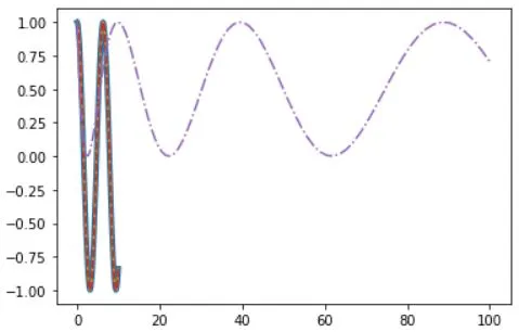
plt.plot(x,y,'--',x**2,y**2,'-.')
plt.setp(lines,color='r',linewidth=4.0)
ax.text(1, -2.1, 'Example Graph', style='italic')
ax.annotate("Sine", xy=(8, 0), xycoords='data', xytext=(10.5, 0), textcoords='data', arrowprops=dict(arrowstyle="->", connectionstyle="arc3"),)
plt.title(r'$sigma_i=15$', fontsize=20)
#Limits & Autoscaling
ax.margins(x=0.0,y=0.1) #Add padding to a plot
ax.axis('equal') #Set the aspect ratio of the plot to 1
ax.set(xlim=[0,10.5],ylim=[-1.5,1.5]) #Set limits for x-and y-axis
ax.set_xlim(0,10.5) #Set limits for x-axis

#Legends
ax.set(title='An Example Axes', #Set a title and x-and y-axis labels
ylabel='Y-Axis',
xlabel='X-Axis')
ax.legend(loc='best') #No overlapping plot elements

#Ticks
ax.xaxis.set(ticks=range(1,5), #Manually set x-ticks
ticklabels=[3,100,-12,"foo"])
ax.tick_params(axis='y', #Make y-ticks longer and go in and out
direction='inout',
length=10)

#Subplot Spacing
fig3.subplots_adjust(wspace=0.5, #Adjust the spacing between subplots
hspace=0.3,
left=0.125,
right=0.9,
top=0.9,
bottom=0.1)
fig.tight_layout() #Fit subplot(s) in to the figure area

#Axis Spines
ax1.spines['top'].set_visible(False) #Make the top axis line for a plot invisible
ax1.spines['bottom'].set_position(('outward',10)) #Move the bottom axis line outward
#Save figures
plt.savefig('foo.png')

#Save transparent figures
plt.savefig('foo.png', transparent=True)
plt.show()
plt.cla() #Clear an axis
plt.clf() #Clear the entire figure
plt.close() #Close a window